Memo · Visualization
Five chart types your Excel deck needs
Jordan Supowit
Bottom line
Excel ships a vertical waterfall and a static scatter. That covers two of the five chart types analysts actually reach for. The other three — Sankey, decomposition tree, pictograph — usually mean a trip to Power BI, Tableau, or a separate Python session. This workbook builds them all inside one .xlsm: formulas where Excel does the job well, native charts where Excel already has the right primitive, VBA where I need a custom layout, and a single VBA button that shells out to a small matplotlib script when the visual deserves plotly-quality rendering. No Power BI, no Microsoft 365 dependency.
Architecture, tab by tab
Nine tabs. Edit one cell in 02_Source_Data and the downstream tabs that drive native charts update immediately. The two image-based tabs (Sankey, Pictograph) carry a refresh affordance for re-rendering.
| Tab | Build path | Refresh |
|---|---|---|
| 02 Source data | Plain cells: monthly profile, cost %, annual target | edit directly |
| 03 Sankey | matplotlib PNG embedded | VBA button → Python |
| 04 Horizontal waterfall | Native stacked bar, formula helpers | live |
| 05 EBITDA walk | Native stacked bar, 11 drivers | live |
| 06 Decomposition tree | VBA-drawn Shapes | button + Workbook_Open |
| 07 Interactive scatter | Native scatter + scroll-bar form control | drag the slider |
| 08 Waffle | 100 cells + conditional formatting | live |
| 09 Pictograph | Native column chart, picture-fill stack-and-scale | live |
1. Sankey — where the money actually goes
The first thing a P&L slide tries and fails to do is show flow. Five revenue segments funnel through one of two destinations: Cost of Revenue, or Gross Profit. Bar charts can’t show that attribution. Sankey does.
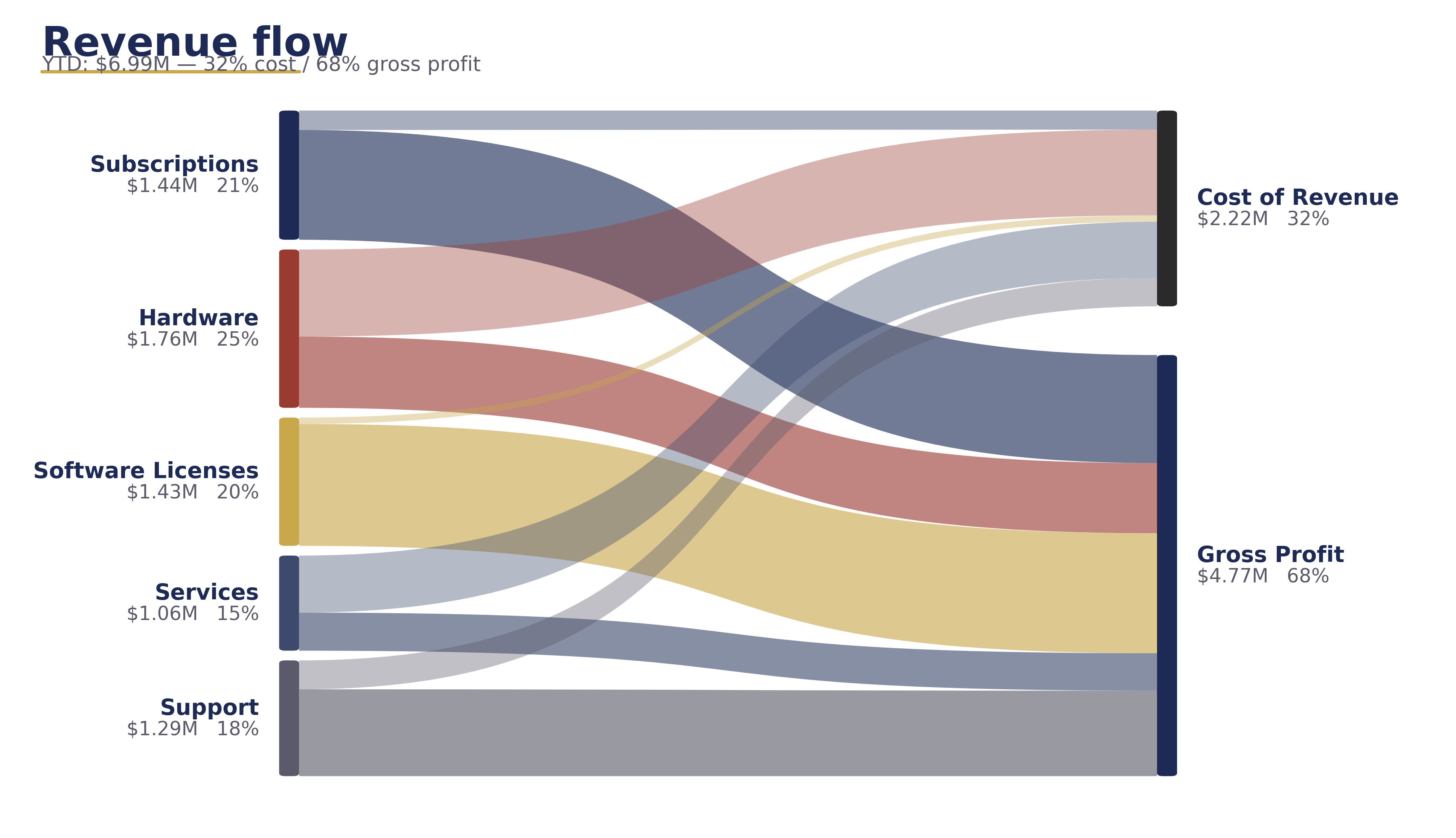
How it’s built:
- A formula-driven helper table at
A5:D10computes revenue, cost ($ = revenue × cost%), and gross profit per segment. - A small Python script (matplotlib PathPatch with cubic Bezier control points) renders the Sankey PNG.
- A VBA
RefreshSankeymacro exports the helper-table cells to%TEMP%\sankey_refresh.csv, shells out topython refresh_sankey.py(hidden, synchronous), then swaps the image in place. Excel stays open the whole time.
2. Horizontal waterfall — variance walks at scale
Excel’s native waterfall is vertical only. Fine for six drivers with short labels; collapses at eleven drivers or when names like "Marketing reallocation" force rotated text. Rotated text is a clue you needed a horizontal layout.
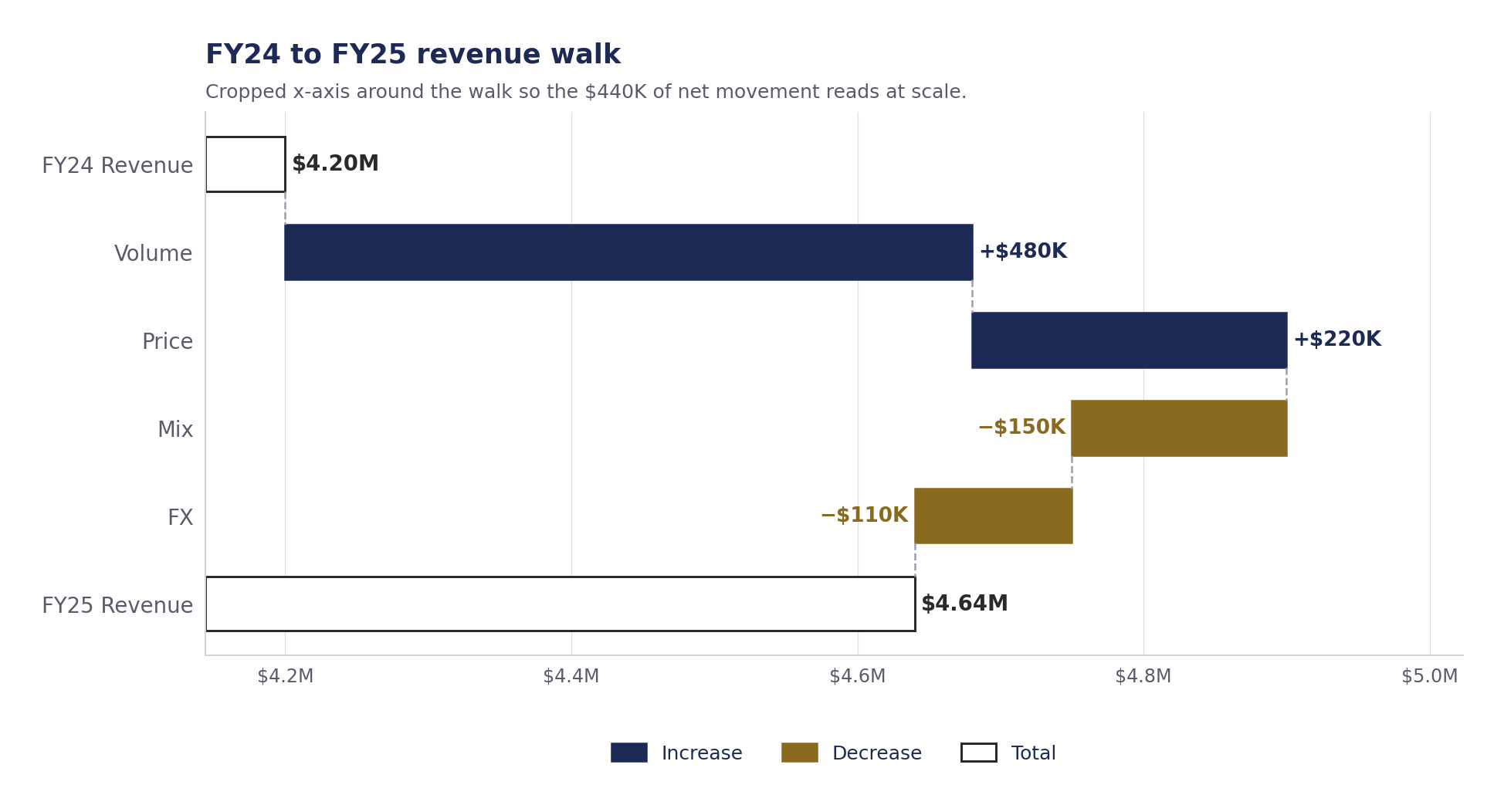
The math, one row per driver:
Invisible_Baseis the running total before this driver lands. For an increase: previous running total. For a decrease: the new (lower) running total.Pos_DeltaandNeg_Deltacarry the bar length; the chart colors them differently.- Total rows hold the full running total in their own series, zero base. Pos and Neg are zero on total rows — a gotcha I hit on the first build that double-stacked the first bar.
3. Decomposition tree — drill three levels
The Power BI decomp-tree maps cleanly onto how finance teams talk: "Total revenue, broken by segment, then within the biggest segment, broken by quarter." The same cascade renders in Excel with VBA-drawn FancyBboxPatch rectangles and connector lines.
Aggregations are formula cells (SUM and per-segment quarter totals). A Refresh decomp button on the tab redraws the shapes from those cells; Workbook_Open draws them once when the file opens.
4. Interactive scatter — Excel’s answer to Play Axis
Power BI’s Play Axis animates a scatter over time. Pretty in a live demo, useless in a printed deck. The Excel equivalent is a scroll bar form control bound to a cell, with INDEX formulas pulling the active quarter’s revenue and margin per segment. Drag the slider, the chart updates.
SUMPRODUCTaggregates each segment’s revenue and margin per quarter into a 5×4 table.- An "active view" range with
=INDEX(...,$B$6)picks the column the scroll bar selects. - A native scatter chart reads from the active view. No VBA needed; the form control rewires the formula chain.
5. Pictograph — picture-fill column chart
Native Excel can fill a column chart with a picture, and stack the picture in fixed units instead of stretching. Each gas pump represents $200K; bars become stacks of pumps; the human eye reads them faster than a number above a bar.
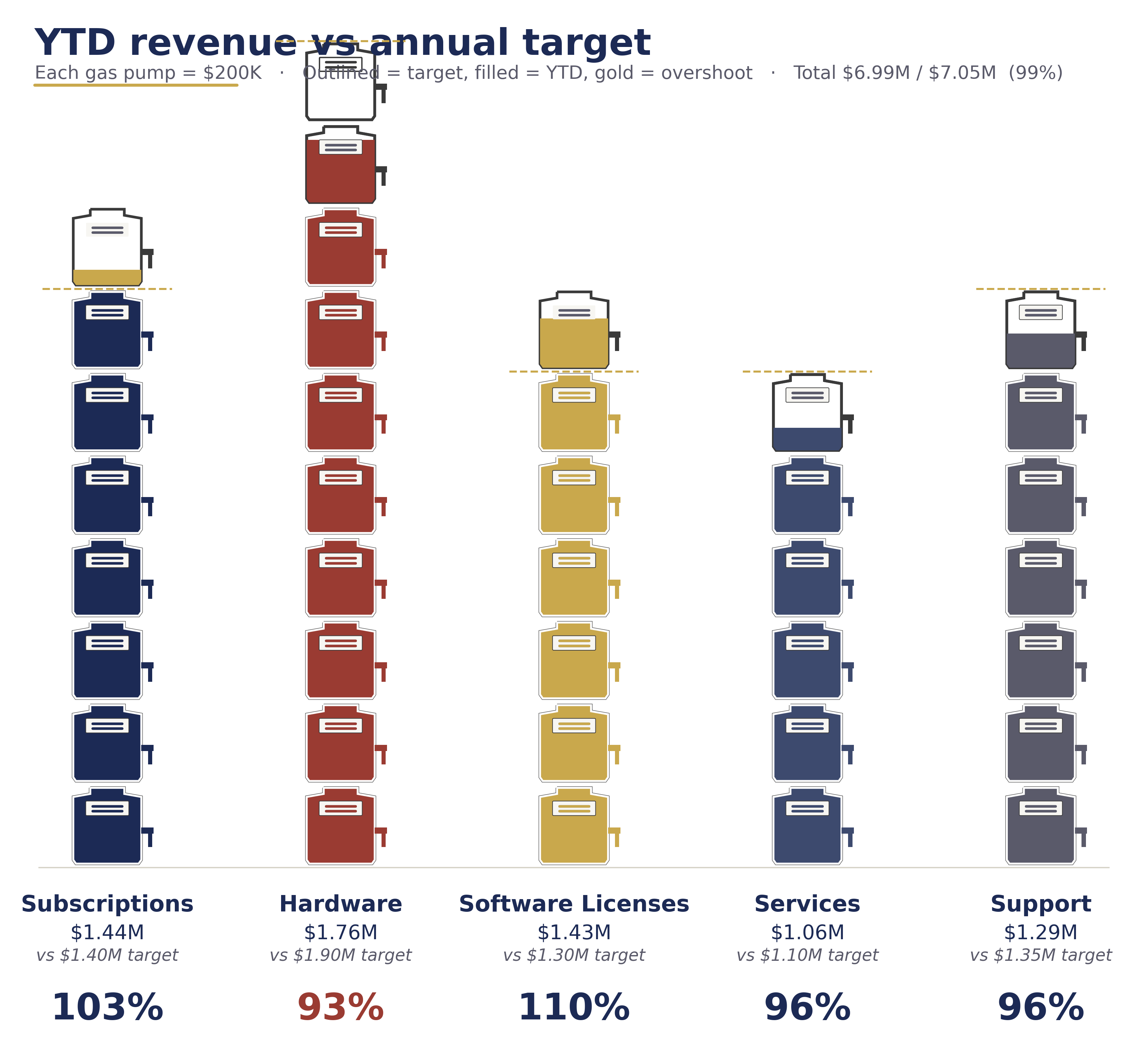
How: 2D Clustered Column chart. Right-click a bar → Format Data Series → Fill → Picture or texture fill → enable Stack and Scale with → set units to 200000. Use the included gas-pump.png or your own icon.
Reproducibility — the script is in the workbook
On both the Sankey and Pictograph tabs, scroll below the chart. The full standalone Python script that produces the visual sits embedded in cells, one line per row, ready to copy into a .py file. Three steps: install matplotlib, save the script, run it. No dependency on anything that lives on my machine. Anyone with Python can reproduce the chart locally and edit the data arrays at the top.
Two operating rules that show up everywhere
- Sort by narrative, not by size. Volume first, price/mix second, cost drivers third, FX and one-times last. Size-sorting destroys the story.
- Round labels. "+$1.2M" communicates more than "+$1,184,231." The audit trail stays in the workbook.
Download the workbook
Synthetic data. .xlsm = macro-enabled Excel; enable macros on first open to let the decomp tree draw itself. jordan@supowit.com
Jordan Supowit · supowit.com · for fractional FP&A engagements, see SharpSight Finance.